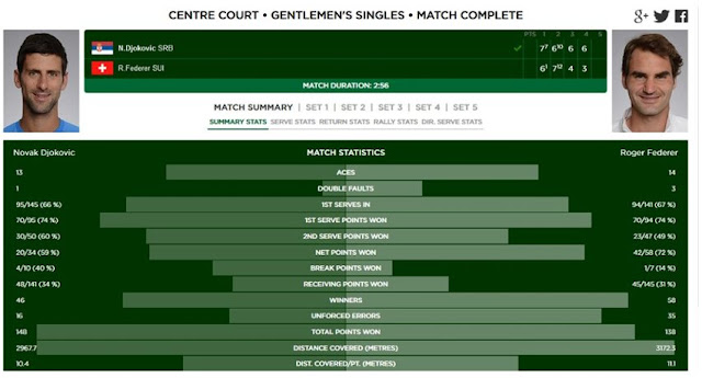
After every tennis match, fans end up with clunky tables of statistics showing all that happened in the match, such as the one below.
While these give you the numbers, they are fundamentally flawed in giving you the match 'summary'.
Why? You may ask!
Well, these are just numbers which compare to each other, for example : Novak hit 1 less Ace than Federer!! Okay... uh.. and 2 double faults less as well.. :(
These are just numbers which can compare against each other if not put in a big picture to view in context. eg. what if I told you, Novak hit 10 of his 13 Aces consecutively, you'd say 'wow! That's something I could have seen if I saw the match.. but I couldn't, so I rely on your table to know about the match'.
I at USTA, set out to correct this misgiving to tennis fans, and I got inspired by the following picture on Stats LLC.

Look closely at center of the iMac screen, that's what the story of the match could look like, and could be represented in such a way.
Using the power of Tableau and contorting the raw tennis data in SQL, I came up with an interactive dashboard to view each match and its details replacing the tabular form.
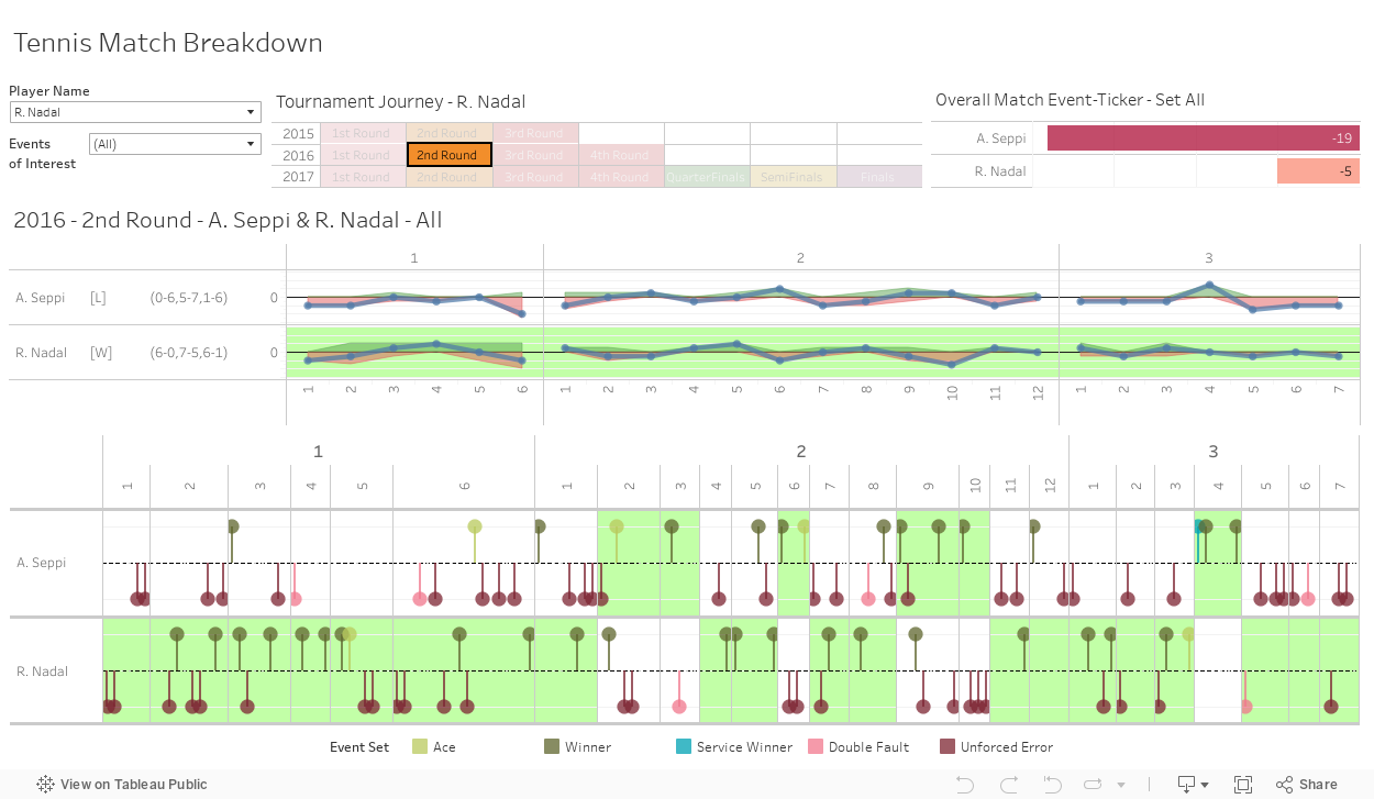
Here, we have created the match timeline. Each element in the visualization denotes something. The color of the pins dropped on the timeline denote relevant events such as Ace, Winners, Double Faults etc. which tell the story of a match. The background green color of the charts denote who won those particular sets or games.
One problem that we needed to solve, was the amount of data on the timeline, there was at times, too much of it. To optimize this, I divide all events into either positive or negative events, this way both sides of the timeline could be used and this added to the viz's aesthetics.
If you like the visualization or have any comments on any bit, feel free to comment.

Why? You may ask!
Well, these are just numbers which compare to each other, for example : Novak hit 1 less Ace than Federer!! Okay... uh.. and 2 double faults less as well.. :(
These are just numbers which can compare against each other if not put in a big picture to view in context. eg. what if I told you, Novak hit 10 of his 13 Aces consecutively, you'd say 'wow! That's something I could have seen if I saw the match.. but I couldn't, so I rely on your table to know about the match'.
I at USTA, set out to correct this misgiving to tennis fans, and I got inspired by the following picture on Stats LLC.

Look closely at center of the iMac screen, that's what the story of the match could look like, and could be represented in such a way.
Using the power of Tableau and contorting the raw tennis data in SQL, I came up with an interactive dashboard to view each match and its details replacing the tabular form.
Here, we have created the match timeline. Each element in the visualization denotes something. The color of the pins dropped on the timeline denote relevant events such as Ace, Winners, Double Faults etc. which tell the story of a match. The background green color of the charts denote who won those particular sets or games.
One problem that we needed to solve, was the amount of data on the timeline, there was at times, too much of it. To optimize this, I divide all events into either positive or negative events, this way both sides of the timeline could be used and this added to the viz's aesthetics.
If you like the visualization or have any comments on any bit, feel free to comment.
Comments
Post a Comment